CIBC · Case study
Turning international money transfers into a guided, transparent mobile flow inside the CIBC app, where every rate, fee, and timeline is clear before you send.
I The problem
International transfers are often confusing, fee-heavy, and trust-sensitive. The goal was to simplify the flow while making every step transparent enough to build confidence on mobile.
II Design goals
Break a dense financial task into calm, single-focus steps.
Show rates and fees upfront, never as a surprise at the end.
Saved recipients and pre-filled details cut re-entry to a minimum.
Larger targets, clearer labels, and accessible form inputs.
III Flow walkthrough
Each screen does one job and hands off cleanly to the next. The rationale beside each frame is the decision that earned its place.
01
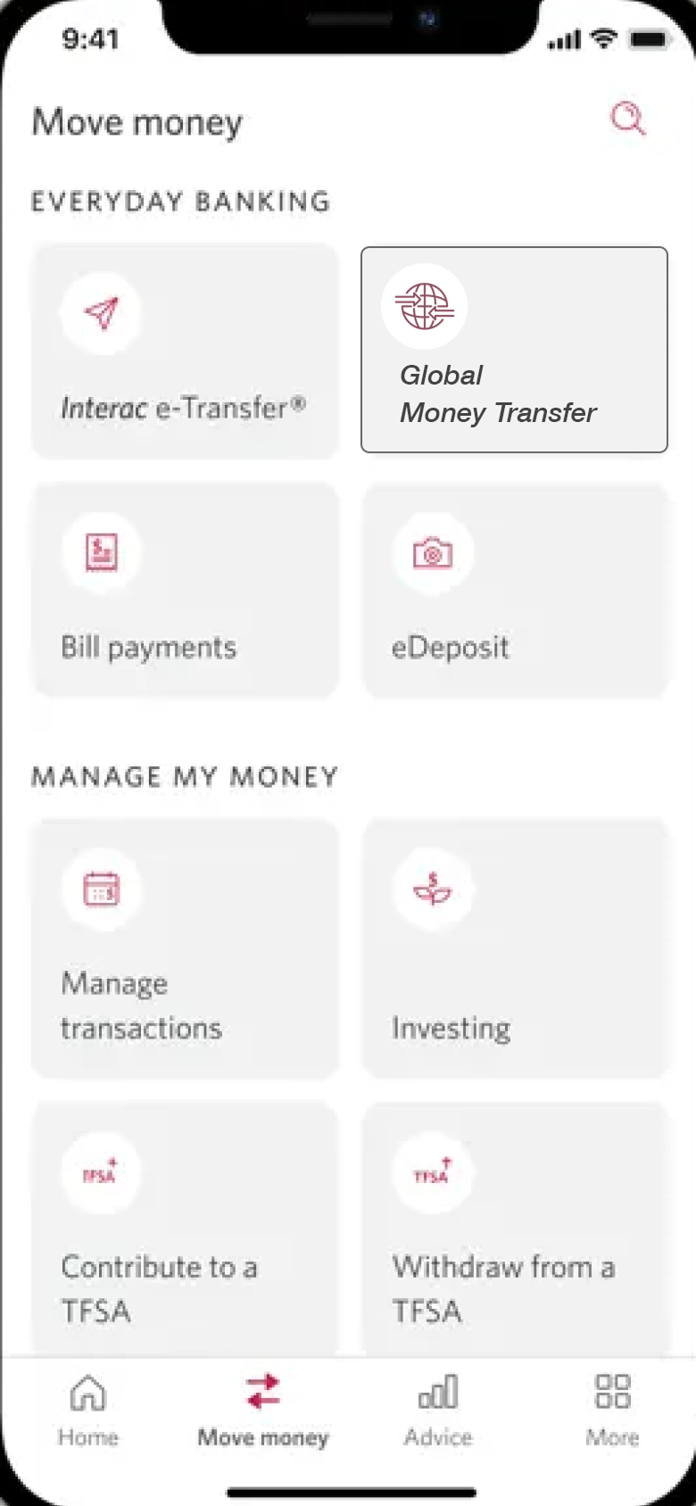
The new transfer module lives inside the existing Move Money hub, following CIBC's design system so it feels native, not bolted on.
02
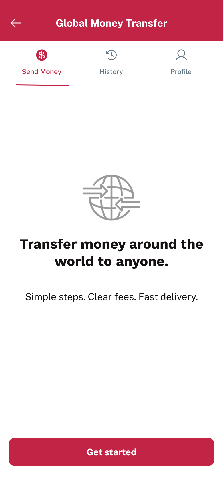
Send Money opens first. History and Profile sit alongside it, so saved recipients and past transfers are never more than a tap away.
03
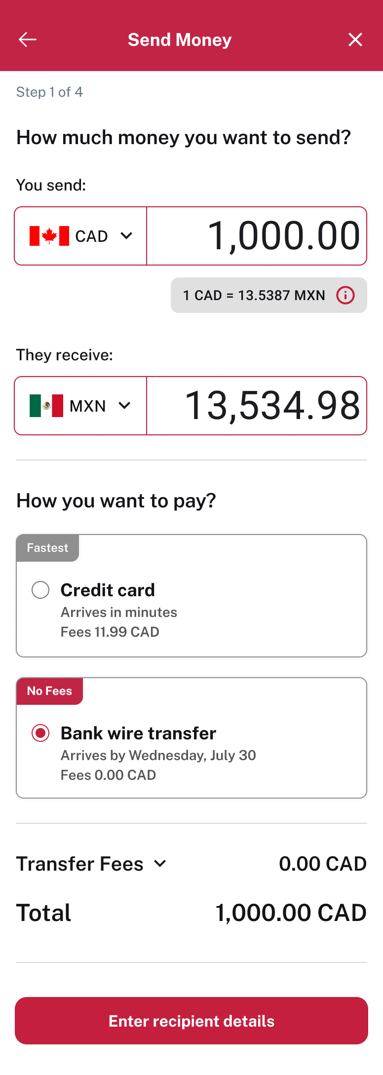
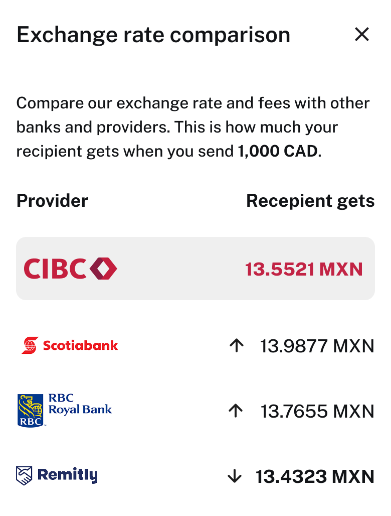
The exchange rate and converted amount calculate live. A tap opens a side-by-side comparison with other providers, and fees are disclosed before any commitment.
04
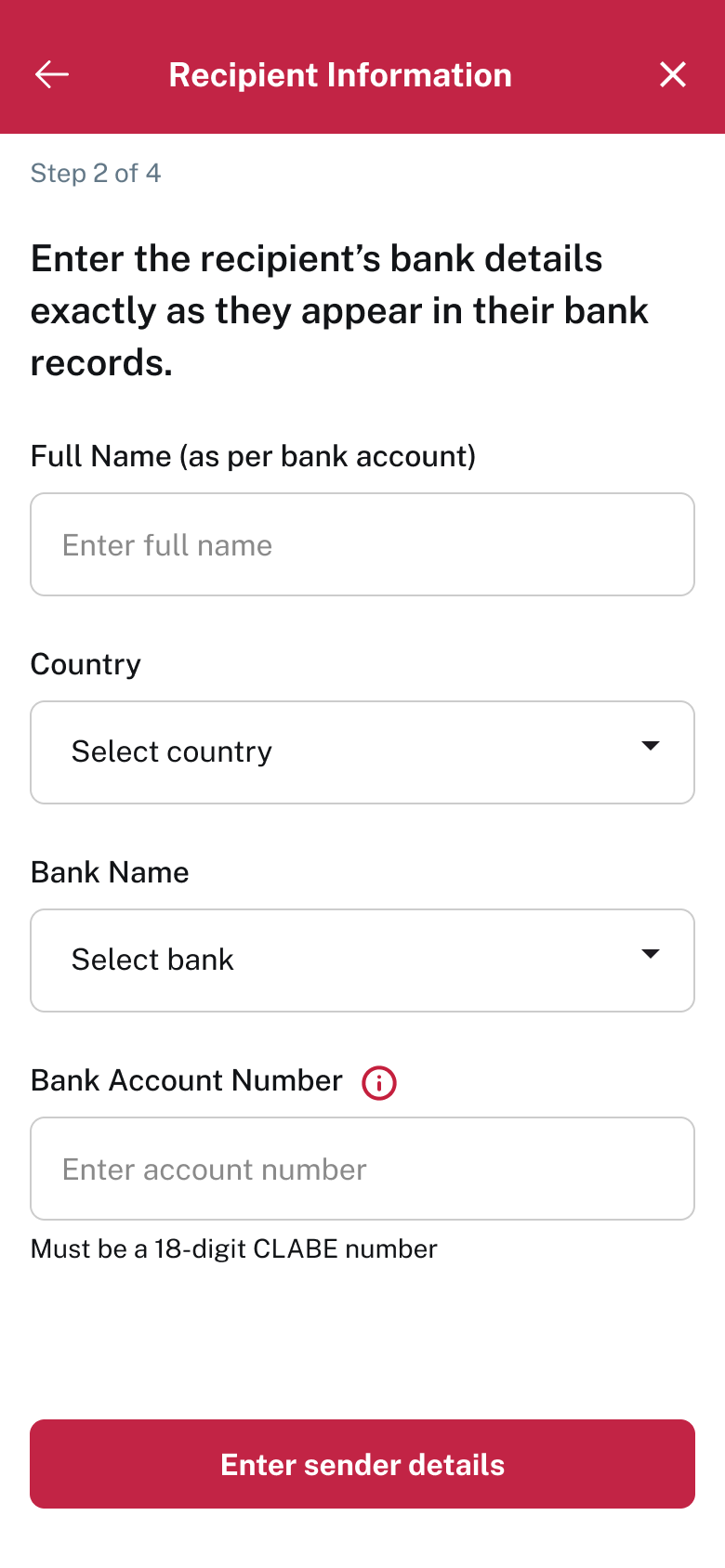
Inputs are restructured and clearly labelled, with help text guiding users to enter details exactly as their bank records show.
05
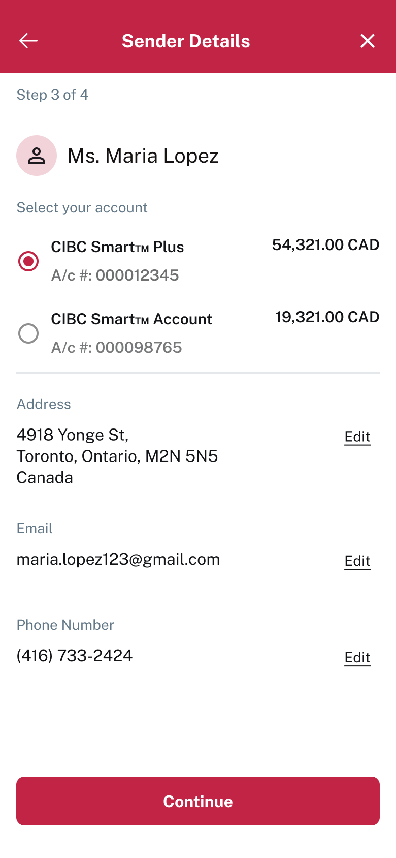
Sender information arrives pre-populated. Users pick a funding account from a list showing live balances, with inline edit to stay in control.
06
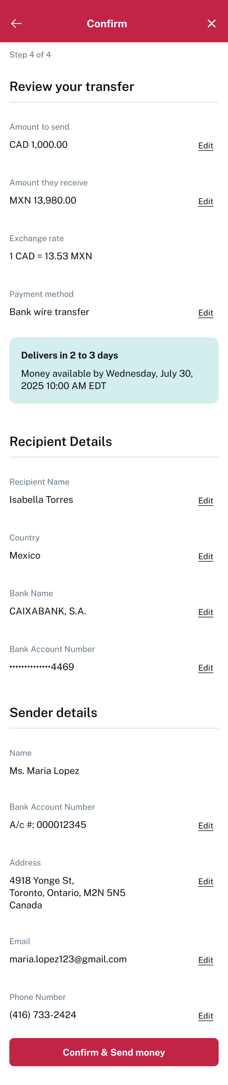
Transfer, Recipient, and Sender are grouped into digestible sections. A highlighted delivery estimate sets expectations right before Confirm & Send.
07
Success confirms the amount, recipient, and timeline. The failure state stays calm and offers retry, a change of method, and visible support.
IV Key UX decisions
Less typing and fewer input errors before sending.
Costs disclosed before confirmation, not after.
Users know roughly when the money will arrive.
Failures offer retry plus a clear alternative.
Frequent transfers complete in a few taps.
V Outcome
Without published metrics, the redesign is judged on how clearly it delivered against what it set out to do.
VI Reflection
What I enjoyed most was taking a sensitive financial task and shaping it into a guided, trustworthy mobile experience, while keeping it consistent with the wider CIBC ecosystem.