Redesigning branch onboarding for advisors and their customers.
This was an advisor-assisted onboarding application used by branch advisors and Universal Bankers to guide customers through account opening and product setup. The goal was to simplify a fragmented, compliance-heavy workflow into a unified, responsive experience optimized for desktop and tablet use in branch environments.
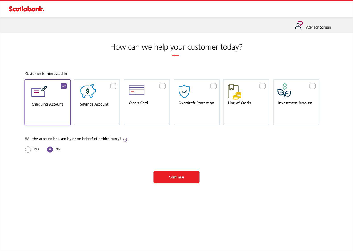
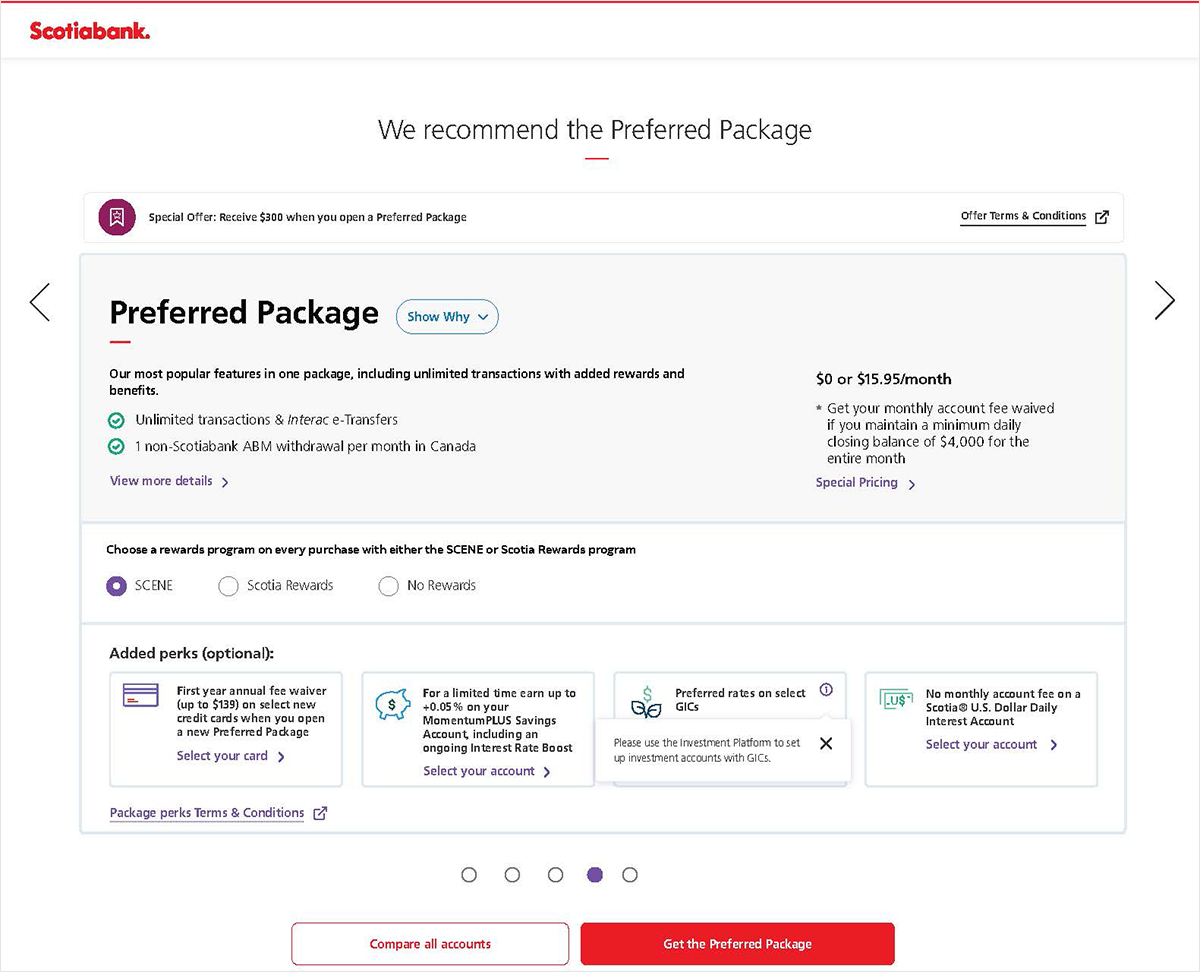
Product selection, the first step of the onboarding flow.
An advisor opening a single account was juggling several products, regulatory requirements, and a live customer conversation at once, across tools that were never designed to work together. The interface was only the surface of a deeper workflow problem.
Fragmented systems. Advisors switched between multiple tools to complete a single onboarding session, creating delays and inconsistencies.
Repetitive data entry. The same customer information was entered multiple times across disconnected forms and screens.
Onboarding took 1 to 2 hours. A lengthy, compliance-driven process that frustrated both advisors and customers, often under branch time pressure.
No shared flow across products. Savings, chequing, and credit each had separate onboarding paths with duplicated steps.
Compliance carried real weight. Required disclosures, ID verification, and regulatory checks were scattered across the journey rather than integrated naturally.
Cross-sell had to happen live. Advisors were expected to recommend relevant products mid-conversation, but the tools gave them nothing to make those suggestions feel informed or natural.
ii.Discovery & workshops
Understanding the workflow before redesigning it.
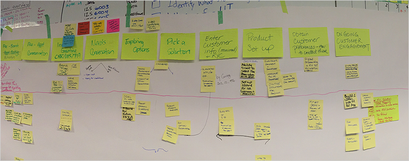
We ran collaborative workshops with advisors and stakeholders to map the full onboarding journey, identifying friction points, repetitive steps, and opportunities to simplify.
Journey mapping workshops with advisors helped surface where the process was most repetitive and where conversations broke down.
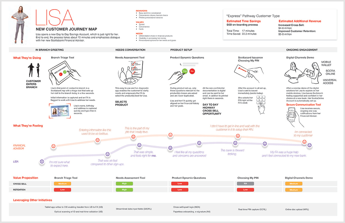
New customer journey map (Lisa), tracing the experience from branch entry to account activation.
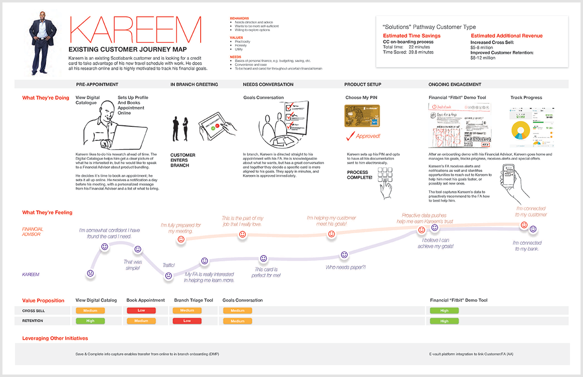
Existing customer journey map (Kareem), showing how onboarding differed for returning customers adding a new product.
iii.The ecosystem
One flow, many people to answer to.
Onboarding sat at the intersection of everyone who touched the account. Each group defined success differently, and the design work lived in reconciling needs that often pulled in different directions.
Customer
A fast, clear path to opening an account without repeating themselves.
Universal Banker
A guided flow they could run confidently without deep product training.
Branch Advisor
Support for a natural conversation, not a form to fight through.
Product Manager
Higher completion and relevant, well-timed product recommendations.
The design work
Balancing competing needs into one experience.
Compliance
Every required disclosure and identity check captured, on the record.
Engineering
One maintainable flow instead of three separate product builds.
Business
Cross-sell that genuinely fit the customer, not a scripted upsell.
Accessibility & QA
WCAG AA by default, with predictable, testable states throughout.
The real work was reconciliation. Most decisions came down to satisfying a regulatory or business requirement while keeping the customer conversation human, then finding the version that worked for both rather than trading one off against the other.
iv.Onboarding flow
One unified flow for all three products.
The redesign consolidated savings, chequing, and credit onboarding into a single adaptive flow that branches only where products genuinely differ, reducing duplicated steps across the advisor workflow.
The onboarding journey
01
Customer Lookup
Existing customer
02
Product Selection
Multi-product
03
ID Verification
Compliance
04
Needs Assessment
Conversation
05
Product Recommendation
Guided
06
Personal Information
Pre-filled
07
Summary & Activation
Handoff
v.Early wireframes
From workflow sketches to interaction design.
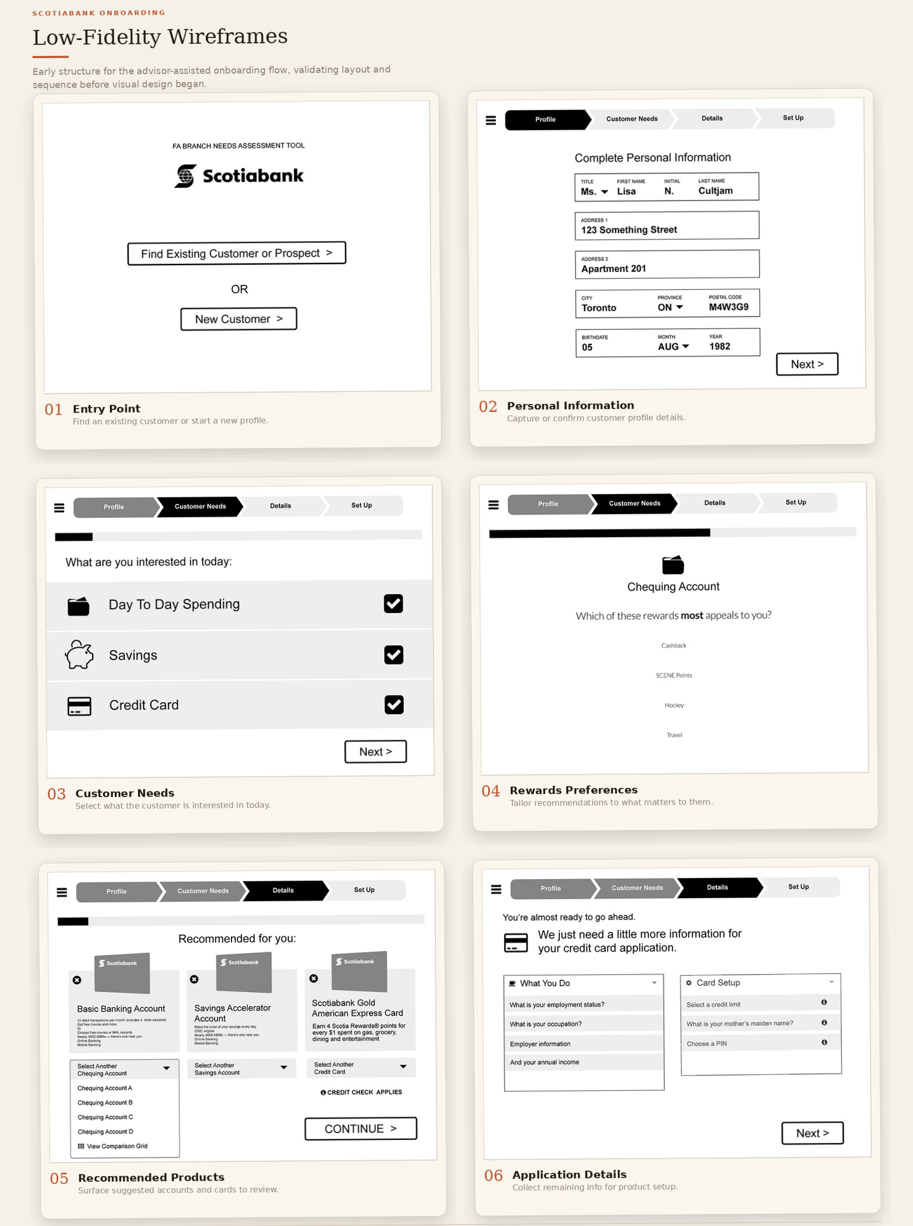
Early wireframes focused on modular onboarding flows and dynamic product recommendations, validating structure and information architecture before visual design began.
Low-fidelity wireframe of the personal information step, showing the step indicator, grouped form fields, and navigation pattern used throughout the flow.
vi.Critical design decisions
The choices I'd defend in any review.
Four decisions shaped the experience more than any visual choice. Each one balanced a real constraint, regulatory, operational, or business, against keeping the customer conversation human.
01
Product selection before any data collection.
The problem
The legacy flow asked for personal and compliance data early, before the customer had committed to a product, front-loading effort onto people who might still walk away.
Options considered
Collect all data upfrontAsk product intent firstAdvisor-only routing
The decision
Start by choosing the products, then let the flow adapt to only what those products actually require. Intent first, data second.
Why it mattered
It set the tone for the whole session. Customers invested in a choice before being asked for effort, and every later screen could be tailored instead of generic.
02
A needs assessment before any recommendation.
The problem
Advisors were expected to cross-sell live but had no structured way to know what a customer actually needed, so recommendations came across as scripted upsells.
Options considered
Advisor free-selectsStatic product catalogueShort needs assessment first
The decision
A brief, plain-language needs assessment that feeds directly into the recommendation, so the suggestion is grounded in what the customer just said.
Why it mattered
It turned cross-sell from a pitch into a relevant recommendation the advisor could explain naturally, which served the business and the customer at the same time.
03
Progressive disclosure of compliance-heavy data.
The problem
Compliance required a large amount of regulated information. Asking for all of it at once made the flow feel like filling out a regulation rather than opening an account.
Options considered
Front-load all compliance dataOne compliance step at the endDisclose progressively, in context
The decision
Surface each regulatory question at the point it became relevant, with a firm validation gate before account creation so nothing could be missed. Compliance's instinct was to ask everything upfront; working through the flow together showed the same data could be captured without front-loading it.
Why it mattered
Compliance still got everything it required, but the customer never felt the full weight of it at once. It was the clearest case of satisfying regulation without punishing the person on the other side.
04
One responsive flow for desktop and tablet.
The problem
Advisors worked on different hardware across branches. A desktop-only design forced awkward workarounds on tablet, while two separate designs would double the work and drift apart over time.
A single responsive flow designed to hold up from tablet to desktop, using the same components and interaction patterns throughout.
Why it mattered
The experience stayed consistent regardless of where an advisor sat, and there was one flow to maintain and extend rather than two. This was about advisor hardware in branches, not a consumer mobile app.
vii.The final experience
Walking through the redesigned onboarding flow.
Each step was designed to support the advisor-customer conversation by reducing manual effort, surfacing the right information at the right time, and guiding both parties through the process naturally.
A note on what's shown. These screens are from the advisor-facing onboarding application built for use in Scotiabank branches between 2016 and 2020. Customer names and data shown are fictional.
Step 01 · Product Selection
Advisors select products upfront, before collecting any information.
Choosing products first means the subsequent flow adapts dynamically, only showing questions relevant to what was selected.
A
Advisors could select multiple financial products at once, and onboarding adapted to cover all chosen products in a single session.
B
A compliance question about third-party account use is surfaced here, before the flow continues, keeping it contextually relevant.
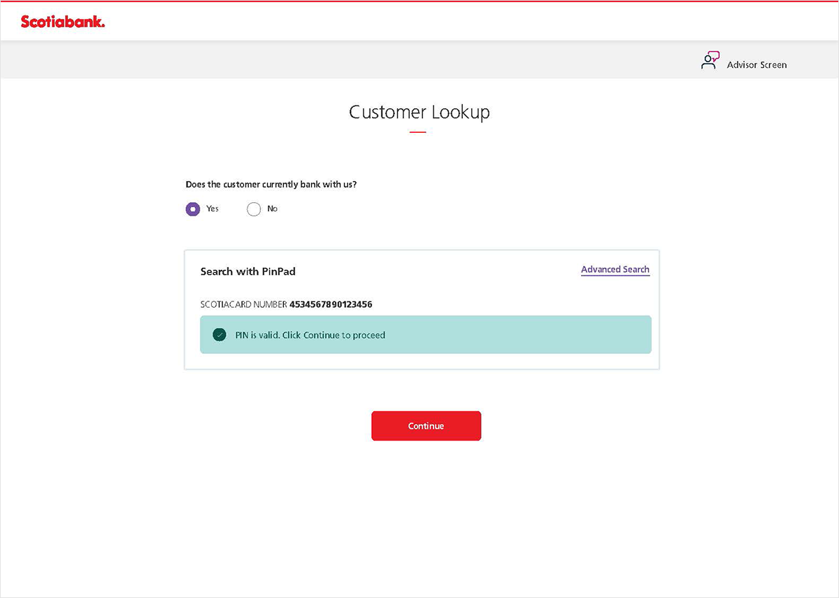
Step 02 · Customer Lookup
Returning customers are identified quickly, with no manual re-entry.
For existing Scotiabank customers, PIN validation pulls their profile directly, eliminating repetitive data entry for information already on file.
C
Returning customers could be identified in seconds via PinPad, reducing the need for advisors to manually enter existing profile data.
D
A clear success state confirms identity before the flow proceeds, reducing error risk at this compliance-critical step.
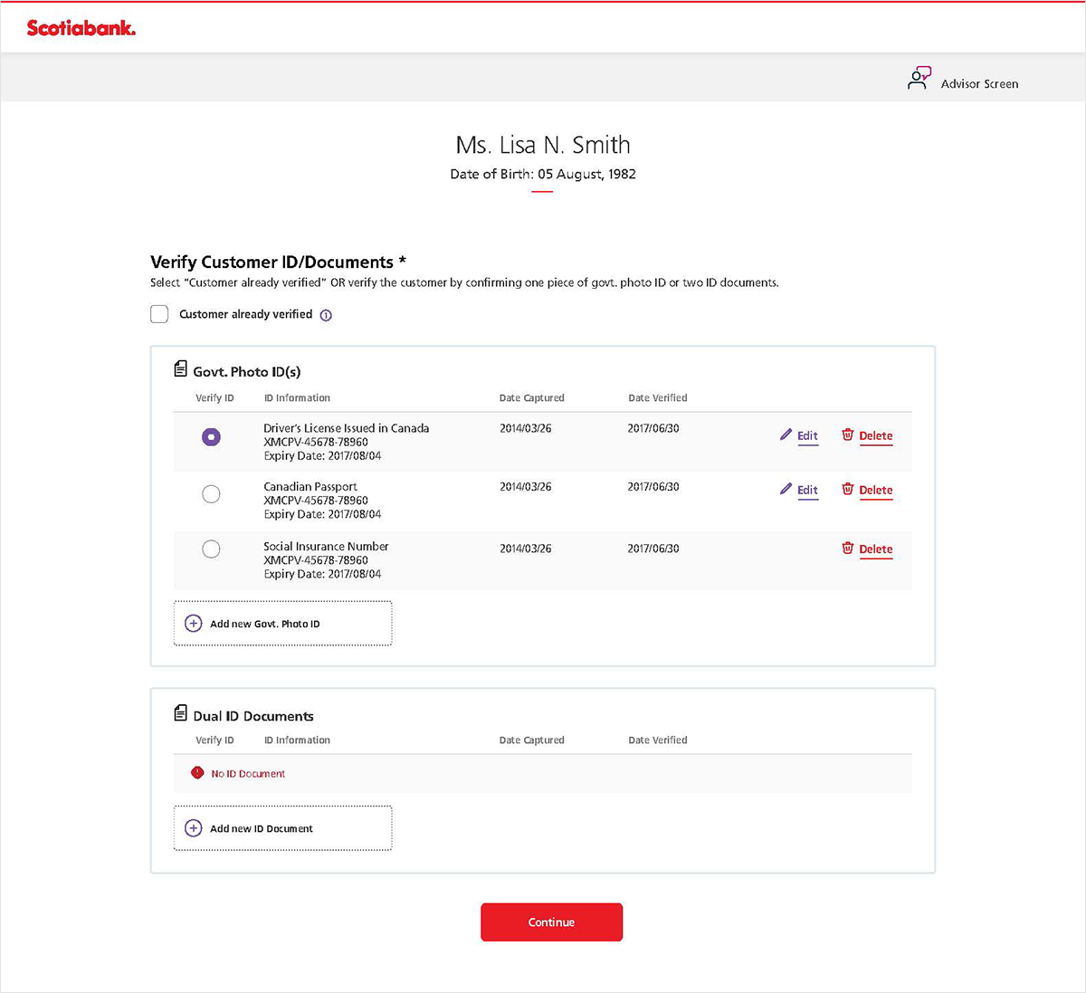
Step 03 · ID Verification
Centralized identity documents, with status visible at a glance.
All ID documents on file are surfaced in one place, with verification dates and status clearly visible. Advisors can confirm, update, or add documents without navigating away.
E
Centralized ID management improved compliance workflows, letting advisors see what was already verified versus what needed attention in one view.
F
Pre-filled document data from the customer profile reduced manual entry effort for existing customers.
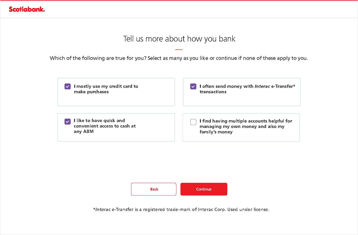
Step 04 · Banking Habits & Needs
A short needs assessment, designed to guide the conversation.
Simple checkbox questions help advisors understand how the customer uses banking. Written in first-person language to feel conversational, not clinical.
G
Onboarding questions helped tailor product recommendations, since selecting habits feeds directly into the suggestion on the next screen.
H
First-person language ("I mostly use…") made the questions easier for advisors to read aloud and discuss naturally with customers.
Step 05 · Recommended Package
Contextual product recommendation, with room to explore.
Based on the habits selected, the most relevant package is surfaced automatically. Advisors can explain the recommendation, compare alternatives, and configure add-ons in one place.
I
Contextual cross-sell opportunities were embedded directly in onboarding, aligned with the customer's stated banking behaviours.
J
Product recommendations came with a "Show Why" disclosure, giving advisors language to explain the suggestion naturally.
Step 06 · Product Configuration
Modular setup patterns, with expandable sections to reduce visual overload.
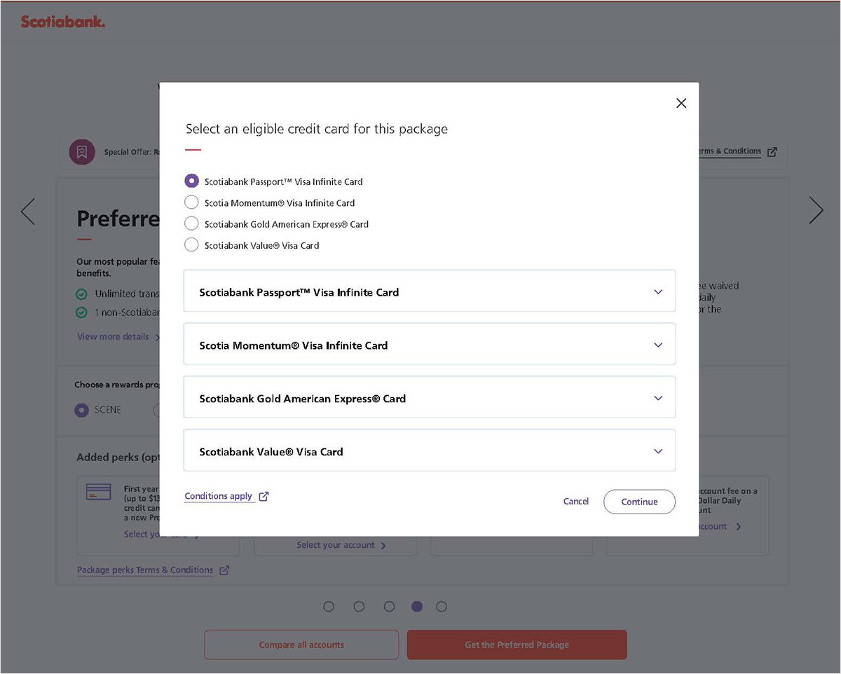
Configuring a credit card within the package opens a focused modal, keeping the selection contained without sending the advisor down a separate path.
Expandable accordion sections in the modal reduced visual overload by showing detail only when the advisor or customer needed it.
Step 07 · Personal Information
Pre-filled where possible, grouped logically for fast review.
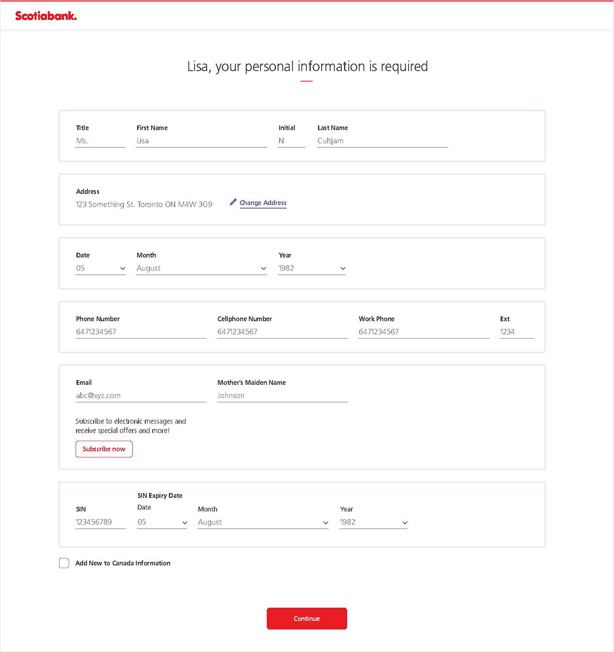
Personal information arrives pre-filled from the customer profile. Fields are grouped by section, such as name, address, contact, and identity, making it easy to review and correct without missing anything.
M
Reusable form patterns improved consistency across the onboarding workflow, since the same components were used throughout the application.
N
Responsive layouts supported advisor-assisted onboarding on both desktop and tablet, so the same flow worked across branch environments.
Step 08 · Product Summary & Activation
Everything reviewed in one place, before the customer leaves.
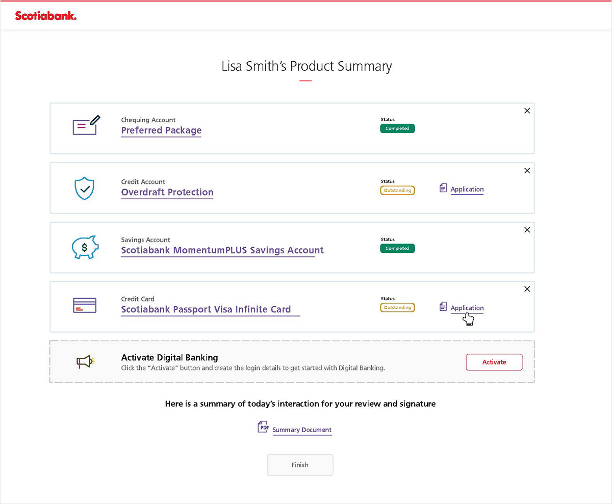
The final screen shows all products from the session, including completed items, outstanding items, and next steps. The advisor can initiate digital banking activation and provide a summary document for the customer to sign.
O
Advisors could review onboarding progress in one place, with completed and outstanding items clearly differentiated by status.
P
Digital banking activation and summary document generation were available directly in the final screen, supporting handoff before the customer left the branch.
Screens shown are from the advisor-facing onboarding application used in Scotiabank branches. Customer names and data shown are fictional.
viii.Strategic design contributions
How I contributed beyond the screens.
My involvement went beyond visual design. I worked across teams to align the experience with business goals, compliance needs, and advisor workflows.
i
Journey mapping workshops
Facilitated collaborative sessions with advisors and stakeholders to map the existing onboarding experience and identify friction points.
ii
Compliance workflow simplification
Collaborated with compliance teams to find a flow that collected required information at the right moment, without front-loading the experience.
iii
Modular onboarding patterns
Contributed to reusable form and flow patterns that could adapt to different product combinations, reducing design debt across the onboarding system.
iv
Cross-sell integration
Worked with product and business teams to embed contextual product recommendations naturally into the onboarding flow.
v
Responsive advisor workflows
Designed responsive layouts that worked consistently across desktop and tablet, supporting the diverse hardware used in different branch environments.
vi
Accessibility & component design
Delivered WCAG AA-compliant form components with full developer handoff specs, creating reusable patterns that extended beyond this project.
What I owned
UX and interaction design across the full flow: discovery and journey mapping, information architecture, wireframes and prototypes, the interaction and responsive patterns, accessibility, and developer handoff.
What others owned
Product managers owned delivery and priorities. Engineering owned the build. Compliance, legal, and risk owned the regulatory decisions. My role was to make those requirements work as one coherent experience.
ix.Outcome
Outcomes, grouped by who felt them.
The clearest win was time, but most of what improved is best described qualitatively. Rather than inflate the numbers, here is what changed for each group that touched the flow.
Onboarding time
15-20min
Reduced from 1 to 2 hours, so advisors could complete most onboarding sessions in a single conversation
Accessibility
WCAG AA
Built into components from the start, not remediated after delivery
Responsive design
Desktop + tablet
Consistent advisor experience across all branch hardware environments
Customer outcomes
No more repeating themselves. Opening an account stopped requiring information the bank already had on file.
Finishable in one sitting. A shorter, clearer path meant most customers could complete onboarding in a single visit.
Advisor outcomes
One flow, not many tools. Advisors no longer switched between disconnected systems mid-conversation.
A structure for the conversation. Needs assessment and recommendations gave advisors a natural way to guide product discussions.
Business & operational outcomes
Faster onboarding. Time dropped from 1 to 2 hours to roughly 15 to 20 minutes (directional, based on the redesigned flow).
One flow to maintain. A single adaptive journey replaced three separate product builds.
Accessibility & design-system outcomes
Accessible by default. WCAG AA was built into components rather than remediated after delivery.
Reusable patterns. Form and interaction patterns contributed to the design system and were used on later projects.
x.Reflections & learnings
What I'd keep, change, and build next.
↻ Would do again
Involve compliance in design reviews early.
Including compliance in working sessions, not just sign-off gates, made it much easier to find solutions that worked for both the user experience and regulatory requirements.
→ Would approach differently
Establish advisor usability testing earlier.
Most design decisions were informed by workshops and stakeholder input. More structured sessions observing advisors using the tool in real branch environments would have surfaced edge cases sooner.
→ Key insight
Modular workflows improved scalability.
Designing the flow as a set of reusable, adaptable modules meant the system could be extended to new products without rebuilding the full experience.
→ Key insight
Simplifying the advisor workflow improved the customer conversation.
When advisors spent less time navigating the tool, they had more attention to focus on the customer. The UX improvement had a direct impact on the quality of the interaction.
Where I'd take it today →
Omnichannel onboarding
A customer might start on their own device and finish with an advisor in branch. Today I'd design the flow to carry progress across both, so the advisor picks up exactly where the customer left off.
Service design beyond the branch
Onboarding doesn't end at account creation. I'd extend the thinking into the first weeks, activation, first transaction, first question, so it's designed as a service rather than a single session.
Where AI fits
AI could summarise a customer's stated needs, draft the rationale behind a recommendation, and flag missing compliance items, freeing the advisor to focus on the conversation.
One ground rule. Regulated steps stay human-owned. AI would speed up the work around them, with clear grounding and an easy override, but the advisor and customer stay in control of the decision itself.
This project reinforced the importance of designing operational workflows that balance business goals, compliance requirements, and human interactions, where the tool should support the conversation rather than interrupt it.