Banking that meets newcomers where they are.
CIBC's Smart Arrival program lets people moving to Canada open a bank account before they land — but the experience wasn't built for someone navigating an unfamiliar financial system in a stressful life moment. I led the redesign of the responsive web journey, from landing page through eligibility and application, reducing friction across an emotionally and bureaucratically heavy moment.
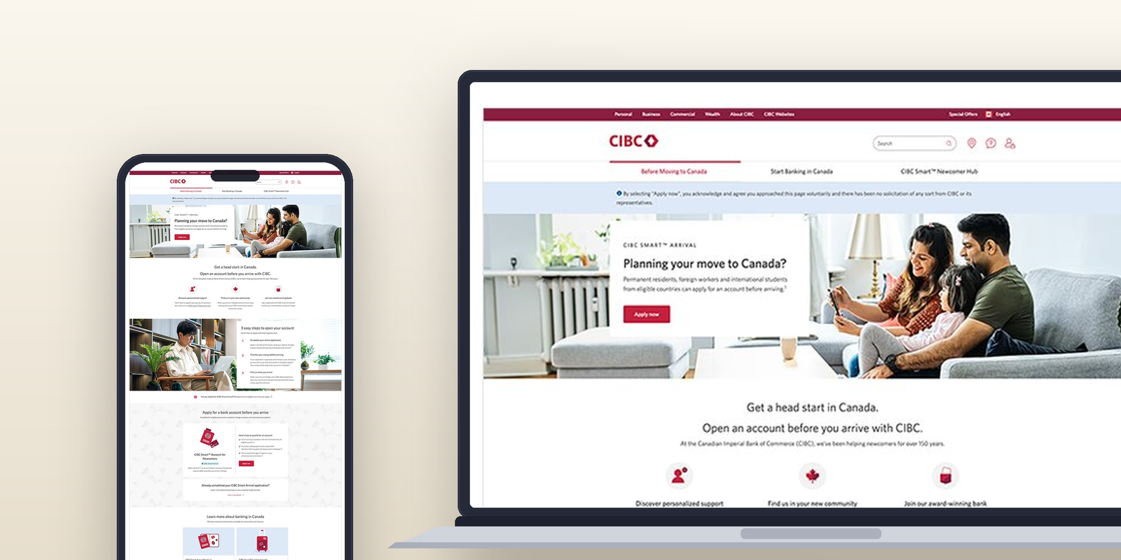
- Client
- CIBC Digital Banking, via IBM iX
- Role
- Senior Product Designer Interaction & responsive design
- Timeline
- 2022 to 2023 Shipped
- Team
- PM, Engineering, Content, Design Cross-functional
A product built for Canada, not for newcomers.
Moving to a new country is emotionally loaded. The banking experience made it harder than it needed to be, starting too late in the journey and asking for trust it hadn't earned.
- No clarity before arrival. Eligibility was buried in dense copy. Users landed on a generic page with no sense of whether the product was even for them.
- The flow felt risky, not reassuring. Financial transactions in an unfamiliar system, often in a second language. Trust was low from the start, and the design didn't address it.
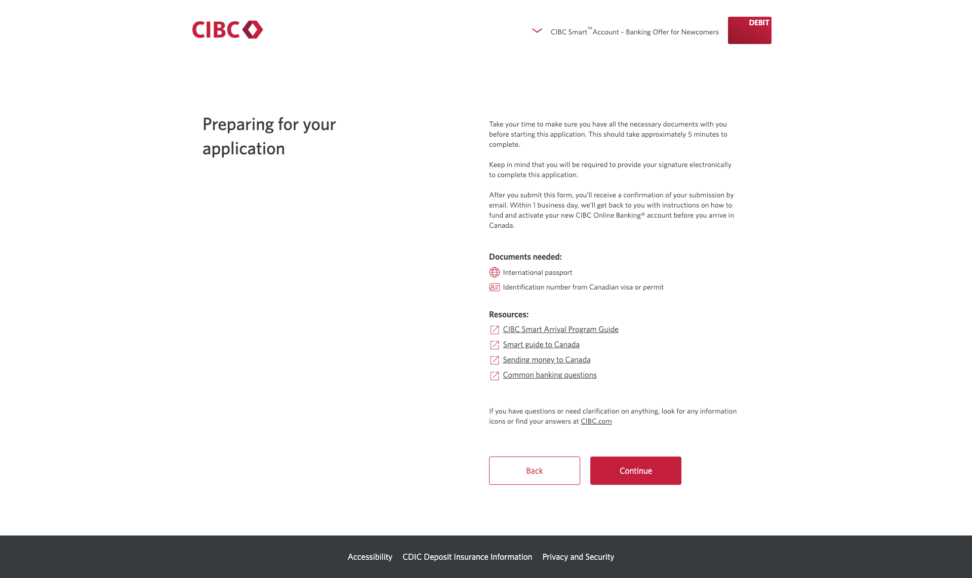
- No document prep before applying. Users hit unexpected document requirements mid-form. There was no way to prepare ahead, so they abandoned and didn't come back.
- Mobile was an afterthought. Most newcomers were on their phones, often before a Canadian SIM or home internet. The mobile experience broke in key places.
Three things that had to be true at the same time.
This wasn't only a usability problem. Drop-off was costing CIBC accounts in a growing segment. The design had to serve users and the business at the same time.
Start the journey before arrival
Eligible users needed to begin, and trust, the process before landing in Canada. That meant building confidence into every screen, not just the form.
Show users exactly what to expect
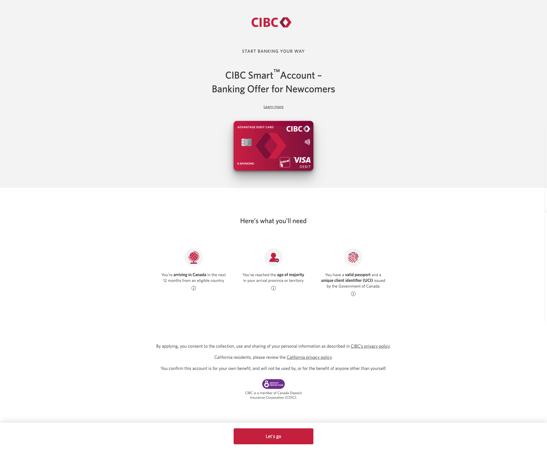
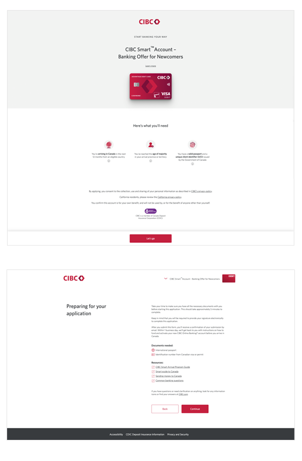
Clear eligibility criteria, a document checklist before the application, and a step-by-step overview, all before asking for any personal information.
Design mobile-first, no compromise
Every interaction decision was made for a small screen in a high-stress moment. Responsive wasn't a checkbox, it was the primary constraint.
One journey, three clear steps.
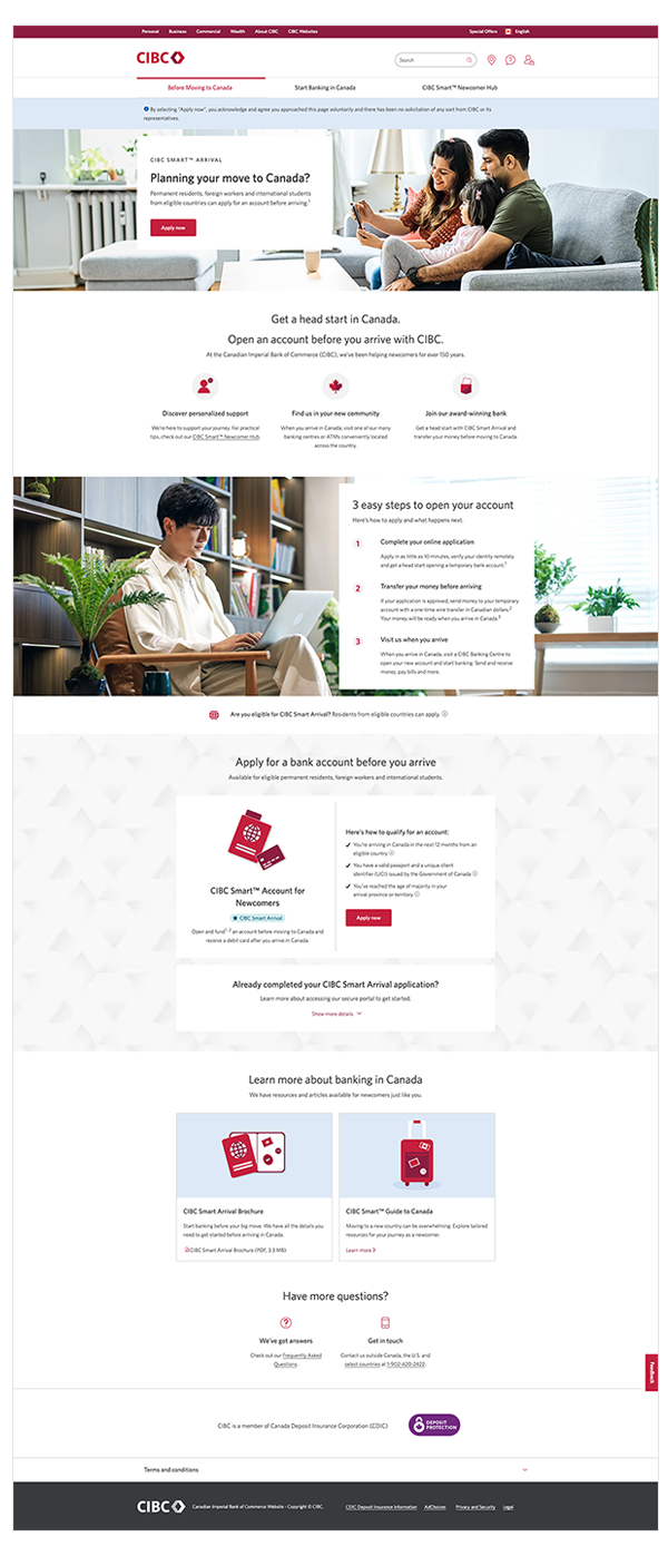
The redesign collapsed a fragmented experience into three plain-language stages, so a newcomer always knew where they were and what came next, from before arrival to their first branch visit.
Apply online
Complete the application in about 5 minutes and open a temporary account before arriving.
Transfer your money
Send funds to the temporary account so they're ready in Canadian dollars on day one.
Visit when you arrive
Activate the account at a CIBC Banking Centre and start banking, paying bills, and more.
Screens that guide, not overwhelm.
Every screen had one job. Each moment in the journey was designed to reduce uncertainty and build the confidence a newcomer needs to keep going.
What the redesign changed.
A simpler journey, stronger trust signals, and a product that served the people it was actually built for, at the highest-risk moment in their move.
The preparation gate was the highest-impact single addition. Adding one screen before the form started measurably reduced the moment where users were most likely to leave.
Trust moved upstream. Transparent eligibility and explicit next-steps reduced anxiety before any personal information was requested.
Mobile became the primary surface. Designing mobile-first changed how every decision was made, not just how the final screens looked.
Patterns extended beyond the project. Eligibility cards, document checklists, and sticky CTAs were reused across the CIBC newcomer product line.
What this project reinforced.
Earn trust before the form, not inside it.
The biggest win wasn't an interaction pattern, it was a single screen that came before the application began. Reducing uncertainty reduced abandonment.
Treat simplicity as a strategic choice.
Every piece of copy we removed and every step we collapsed was a decision with measurable business impact. Less friction meant more completions.
Ship instrumentation with the product.
Some impact is directional because telemetry came after launch. Next time, measurement ships alongside the design so outcomes can be evidenced, not estimated.
Designing for vulnerability is its own discipline.
Newcomers are in a high-stakes, emotionally loaded moment. Designing for that, not just usability, separated this from a generic form redesign.